Expert advice on digital marketing, web design, and ecommerce
Insightsand news
Stay up to date with the latest trends, strategies, and updates in digital marketing and web design. Our blog shares expert tips, industry news, and practical insights to help your business grow online and stay ahead of the competition.
- Home
- Blog
No posts found

June 30, 2025
8 months ago
Search is changing, again. And this time, it’s not just a tweak to rankings or another core update.
It’s...

May 29, 2025
9 months ago
Achieving sustainability for modern businesses isn’t just a choice; it’s a responsibility. At Xanthos...

May 2, 2025
10 months ago
Digital marketing used to be considered an optional channel for businesses. But now, it’s become...

April 30, 2025
10 months ago
Search Engine Optimisation (SEO) is no longer optional for businesses wanting to succeed online. Whether...

April 30, 2025
10 months ago
Success for modern businesses requires more than just a great product or service. The digital nature...

April 30, 2025
10 months ago
Reaching your audience at the right moment is essential for business success. That’s where Google...

April 3, 2025
11 months ago
Digital marketing has transformed the way businesses connect with their audience. With constant technology...

March 20, 2025
11 months ago
Sustainability isn’t just a buzzword; it’s an essential part of how businesses in the UK are operating...

March 20, 2025
11 months ago
Did you know that fossil fuel companies spend billions each year on marketing to downplay climate concerns?...

March 13, 2025
1 year ago
One lucky UK charity will receive a website to boost its online presence completely free of charge.
Cambridge,...

March 12, 2025
1 year ago
The days of traditional fundraising as the primary revenue stream for charities are fading away. With...

March 10, 2025
1 year ago
For many charities, limited resources mean making every marketing effort count. That's where digital...

March 6, 2025
1 year ago
What if you could as much as double your Google Ads budget for free? As a Google Partner agency, Xanthos...

March 3, 2025
1 year ago
Did you know that the internet’s carbon footprint rivals that of the aviation industry? At Xanthos Digital,...

February 28, 2025
1 year ago
The internet is a powerful tool, but it comes at an environmental cost. Every website, every search,...

February 4, 2025
1 year ago
Having a strong online presence is no longer optional for charities—it is essential. A well-designed...

May 23, 2024
1 year ago
In today’s dynamic digital landscape, a robust online presence isn’t a luxury for educational...

May 21, 2024
1 year ago
In the ever-changing digital landscape we exist in today, having a solid online presence isn’t a luxury...

February 28, 2024
2 years ago
Whether you’re a skilled marketer or just stepping into the digital arena, having a digital marketing...
December 15, 2023
2 years ago
As businesses navigate the dynamic landscape of content management systems (CMS), the decision to choose...

November 29, 2022
3 years ago
As Xanthos Digital Marketing celebrates its 20-year anniversary, even looking back on the past 20 years...
August 3, 2022
3 years ago
You’ve finally set up your website and optimised all your site pages but are now unsure of what...

July 29, 2022
3 years ago
Xanthos Digital Marketing is celebrating its 20th anniversary this year in 2022.

July 29, 2022
3 years ago
The world has changed drastically over the past 20 years, and one of the most radical changes comes in...

July 5, 2022
3 years ago
Email marketing plays an essential role in any company’s marketing strategy.
For many, email marketing...

July 4, 2022
3 years ago
Site content alone is the biggest influence on attracting visitors to your site. They want to read, watch...

July 4, 2022
3 years ago
Instagram has become the go-to social media platform for millions around the world. With the might of...

June 7, 2022
3 years ago
Website analytics allows you to review how visitors are directed to your website and how they behave...

June 7, 2022
3 years ago
There are a million and one social platforms that businesses can choose from to help market themselves...

May 31, 2022
3 years ago
Google has commenced rolling out the first broad core algorithm update of 2022 – as officially...
April 29, 2022
3 years ago
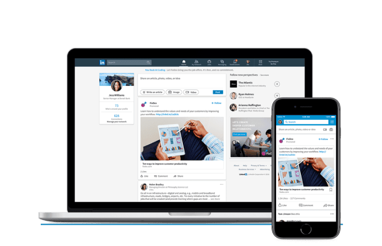
Paid social, or social media advertising, is effectively any form of paid advertising taking place on...

April 27, 2022
3 years ago
On the 14th of April, Elon Musk put forward a proposition to acquire the social media company Twitter...

April 22, 2022
3 years ago
Taking the first step in the SEO process for websites can sometimes feel daunting.
For some, it’s...

March 31, 2022
3 years ago
Google is planning to officially sunset Universal Analytics and make Google Analytics 4 the new standard...

March 29, 2022
3 years ago
So, SEO – is it worth it? We’re sure many of you will already know our answer.
Of course,...

March 22, 2022
3 years ago
On Monday 14th March, 21 courageous volunteers, including myself, my daughter and her Polish friend (acting...

March 1, 2022
4 years ago
Are you a marketer or business owner? Have you recently set up your website but aren’t sure what else...

March 1, 2022
4 years ago
YouTube is working on giving marketers and creators a more in depth analysis about video performance,...
February 28, 2022
4 years ago
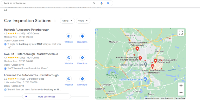
Google has updated how the local map pack appears in the search engine result pages, as it is now directly...

January 31, 2022
4 years ago
Dismissing paid social media advertising as an unnecessary expenditure for a business can be a big mistake.
Many...

January 28, 2022
4 years ago
There’s no other channel like email marketing.
Even after so many years and with so many other communication...

January 28, 2022
4 years ago
Have you ever sent out numerous email marketing campaigns and felt utterly lost with what to do afterwards?
Did...

January 5, 2022
4 years ago
If there’s one thing we know about search engine optimisation (SEO), is that it is constantly evolving....

January 4, 2022
4 years ago
2021 has been a very strange year, following an equally strange 2020. But only three things are certain...

January 4, 2022
4 years ago
One area is always needed with every excellent marketing strategy – performance measurement.
No matter...

January 4, 2022
4 years ago
Content marketing has become increasingly valued by the world over the past few years. In fact, content...

December 1, 2021
4 years ago
Employees will have to put on several different hats when working for some businesses, whether it be...

December 1, 2021
4 years ago
With SEO becoming more recognisable today to help companies strengthen their visibility on search engines,...
December 1, 2021
4 years ago
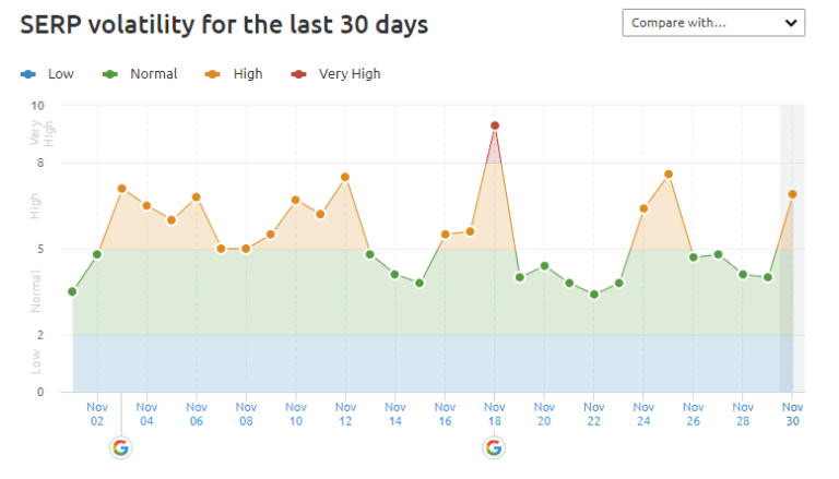
Google rolled out a new broad core update on November 17th 2021, which completed on November 30th 2021.
If...

November 1, 2021
4 years ago
This month, we discovered several new social media updates and features that are currently in trials...

November 1, 2021
4 years ago
In what is possibly the biggest rebrand in recent memory, Facebook has decided it will be known as Meta...

November 1, 2021
4 years ago
In the past 5 years, digital marketing has taken a powerful grip on industry advertising and promoting....

November 1, 2021
4 years ago
Each year, digital marketing platforms find new ways to develop the experiences for their users. Whether...

October 18, 2021
4 years ago
Family-owned investment company, Milbank Group, continues to grow its diversified portfolio of businesses...
September 30, 2021
4 years ago
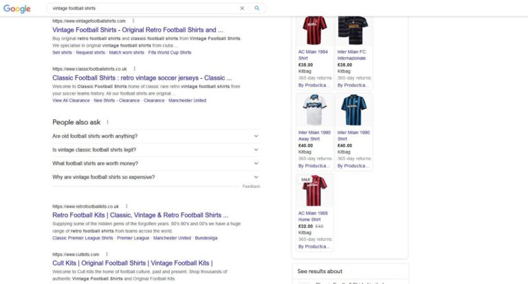
Google confirmed back in August that it changed how titles are generated for search engine result listings.
After...

September 30, 2021
4 years ago
4 digital marketing focuses to start with for your business
You have a business and want to try...

September 30, 2021
4 years ago
What is digital marketing?
According to HubSpot, “Digital marketing encompasses all...

September 28, 2021
4 years ago
Last month, the head of Instagram, Adam Mosseri, announced on his Instagram and Twitter pages that Instagram...

September 2, 2021
4 years ago
Google has officially confirmed it has updated the way it generates web titles in search results.
“Last...
September 1, 2021
4 years ago
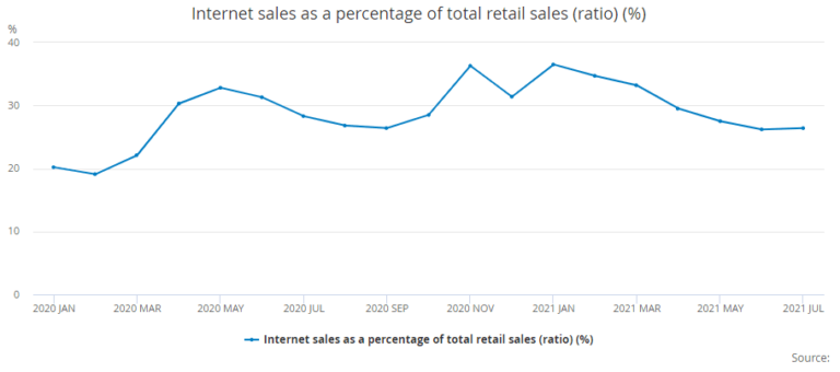
The ONS has published the statistics for ecommerce performance within the UK for July, which was always...
September 1, 2021
4 years ago
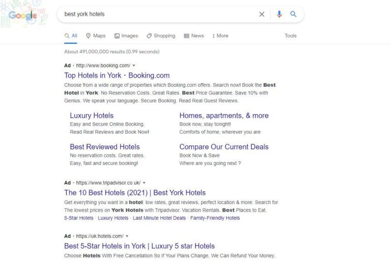
In July 2022, advertisers using Google Ads will no longer be able to create Expanded Text Ads (or ETAs...

August 2, 2021
4 years ago
It is no marketing revelation that social media is a hugely influential marketing platform. Yet, the...
July 30, 2021
4 years ago
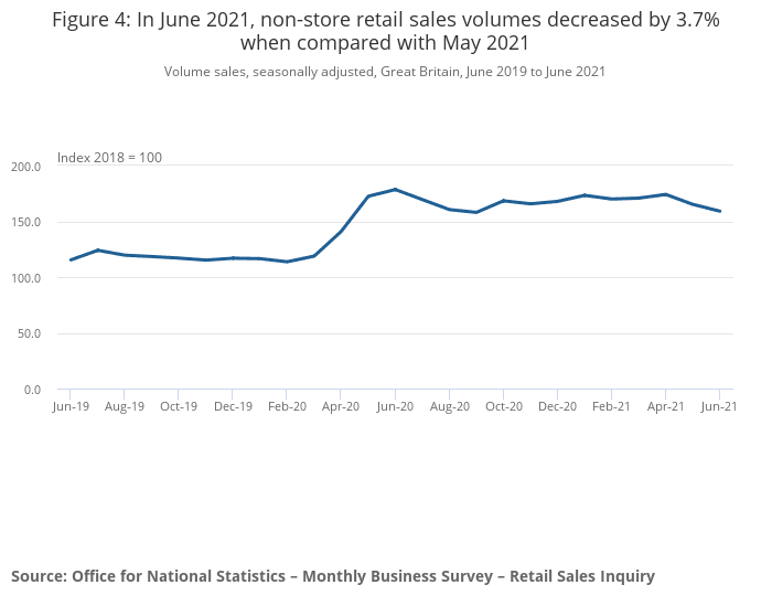
As the UK readied itself to tear up the COVID rules, the retail and ecommerce space seemed uncertain....

July 30, 2021
4 years ago
As of July 26, Google began rolling out a link spam update which would continue to roll out over the...

July 1, 2021
4 years ago
Following Shopify’s expansion with Google – an expansion that brought shopping to a multitude...

July 1, 2021
4 years ago
Rolling out in August 2021, any financial services advertisers or marketers will be required to be verified...

June 30, 2021
4 years ago
Google has been very busy in June of 2021, with multiple updates hitting the SERPS, including a big core...

June 1, 2021
4 years ago
Global ecommerce company, Shopify, has expanded its partnership with Google. This will enable Shopify’s...
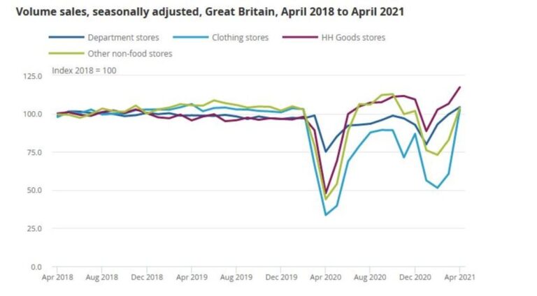
May 28, 2021
4 years ago
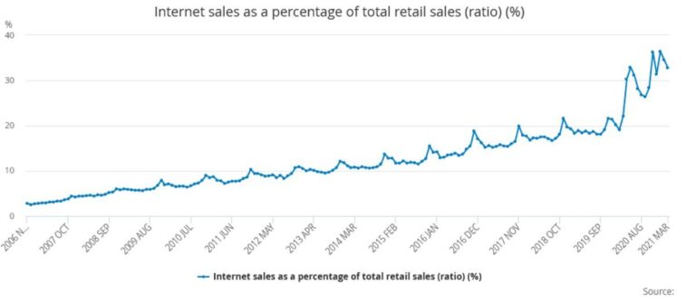
April 2021 saw internet sales as a percentage of total retail sales drop down to 29.4%. In March this...

May 5, 2021
4 years ago
Google announced a new algorithm update which aims to promote high-quality product reviews in the search...
May 5, 2021
4 years ago
As we make the slow and steady return to normality, we are seeing retailers open up their doors to a...
May 5, 2021
4 years ago
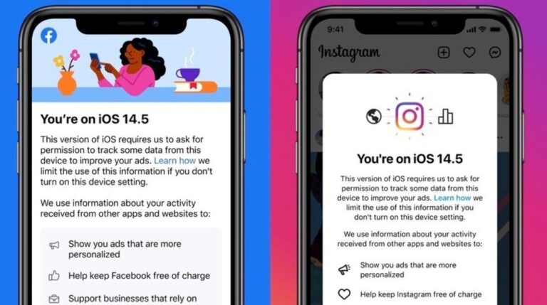
“They collect thousands of pieces of information about you to create a digital profile that they sell...

April 1, 2021
4 years ago
Launching in just one month, Google has shared new details on the forthcoming page experience update....

April 1, 2021
4 years ago
Vital for searchability and visibility, search engine optimisation (SEO) makes a huge difference to the...
March 31, 2021
4 years ago
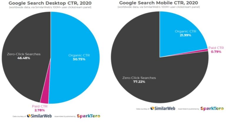
Earlier in March 2021, Rand Fishkin of SparkToro posted an update claiming that in 2020, two thirds of...
March 31, 2021
4 years ago
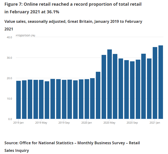
As we approach a year since the beginning of the pandemic, the online retail space has seen a lot of...

March 1, 2021
5 years ago
“Content is king”
You’ve probably heard that before. In fact, it’s been around...

February 26, 2021
5 years ago
2020 has quite possibly been the strangest year that ever was in the modern age. With vaccinations rolling...
February 26, 2021
5 years ago
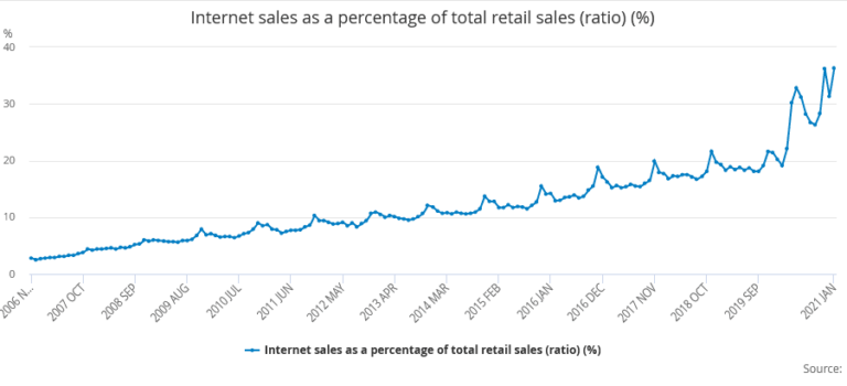
In January 2021, the internet sales as a percentage of total retail sales ratio (as a percentage) hit...

February 23, 2021
5 years ago
What is technical SEO?
To put it simply, technical SEO refers to improving the technical aspects of...

January 31, 2021
5 years ago
If there’s one thing we know about search engine optimisation (SEO), is that it is constantly evolving....

January 29, 2021
5 years ago
2021 is a welcome sight for almost everyone on the planet after what has to be one of the worst years...
January 29, 2021
5 years ago
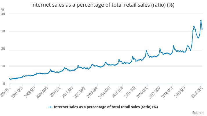
The Office for National Statistics found that in December 2020, the internet sales as a percentage of...

January 5, 2021
5 years ago
At least twice a year, Google make significant, broad changes to their algorithms. These changes are...

December 22, 2020
5 years ago
How does this new uncertainly impact consumerism and online shopping? November and December are traditionally...

December 1, 2020
5 years ago
User experience is nothing new, but in May 2021 it is becoming more important than ever with the upcoming...

November 30, 2020
5 years ago
2020 has almost come to a close, and it has not been a year anyone expected. Especially when it comes...

November 30, 2020
5 years ago
In October, Google announced the release of a major update that promises to benefit both marketers and...

November 27, 2020
5 years ago
COVID-19 has had a profound impact on daily life and businesses. All industries have felt the effects...

November 2, 2020
5 years ago
Having already made some changes this month, and with more updates following by the end of the year,...

October 30, 2020
5 years ago
In the bid to stay connected during the pandemic, people are communicating online now more than ever...

October 30, 2020
5 years ago
2020 has been dominated by COVID-19 everywhere you look. All the news stories revolve around the pandemic,...
October 30, 2020
5 years ago
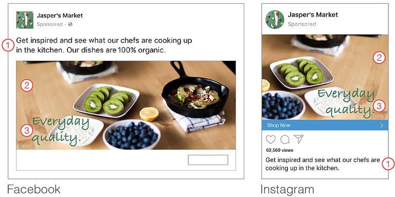
No longer will advertisers need to reformat and edit images in order to meet Facebook's image-to-text...
September 30, 2020
5 years ago
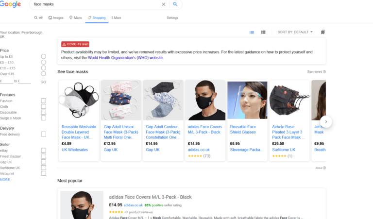
Back in April 2020, Google announced that businesses would be able to list Shopping products for free....

September 30, 2020
5 years ago
Named as the ‘most effective marketing channel of all’ by a recent Omobono study, social media marketing...

September 30, 2020
5 years ago
Early in September, Google announced that it will be passing on the costs of the new Digital Services...
August 29, 2020
5 years ago
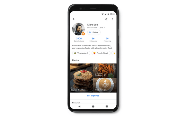
When people think of social media, Google Maps doesn’t tend to get mentioned. However, Maps is...

August 28, 2020
5 years ago
Google is introducing a new label to the Chrome browser, which highlights particular pages with speedy...
August 28, 2020
5 years ago
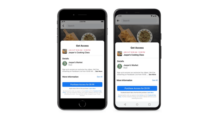
Facebook has launched a new feature which allows SMBs to host paid online events. The new tool is said...
No posts found
Load More
Loading...


