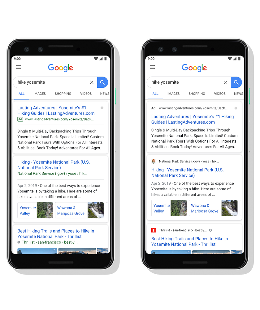
Google is bringing a new look and feel to the mobile search results.
Google is now displaying favicons next to organic search results, as well as streamlining the appearance of Google Ads at the top.
What’s changing with organic search listings and Favicons?
Google is now adding favicons to organic search listings – so favicons now become slightly more important.
The site name and bread crumb appears in black text, next to the favicon above the title link.
Beforehand, Google displayed the name and breadcrumb in green text below the title.
With this new design, a website’s branding can be front and center, helping you better understand where the information is coming from
https://www.blog.google/products/search/new-design-google-search/and what pages have what you’re looking for.
The name ofthe website and its icon appear at the top of the results card tohelp anchor each result, so you can more easily scan the page of resultsand decide what to explore next.

What’s happening to Google Ads?
Not too much – but the look of Google Ads is changing quite a bit.
Google had been testing black Ad labels for a few months, and it now replaces the outlined green label which came into play in 2017.
The Ad label is now displayed at the top of the ad with the display URL in black text, rather than green
When you search for a product or service and we have a useful ad to show, you’ll see a bolded ad label at the top of the card alongside the web address so you can quickly identify where the information is coming from.
https://www.blog.google/products/search/new-design-google-search/
What do I need to do for SEO?
Google has stated it isn’t guaranteed to show in the organic results – but having an eye-catching favicon is surely going to be a best practice for SEO now. That small image could play a big role in whether someone looks at or clicks on your listing.
Google can then find and update your favicon. It should be 48x square.
As we continue to make new content formats and useful actions available—from buying movie tickets to playing podcasts—this new design allows us to add more action buttons and helpful previews to search results cards, all while giving you a better sense of the web page’s content with clear attribution back to the source.
https://www.blog.google/products/search/new-design-google-search/
This redesign is coming first to mobile and will be rolling out over the next few days. Stay tuned for even more fresh ways that Search can help you find what you’re looking for.
What does this mean for Google Ads?
Again, not too much is changing. But Google must have seen positive results to roll this out.
However, the obvious thing to point out here is that Google Ads are now less distinguished from organic listings than before, when they were green.
While to myself and probably many others, the change is quite noticeable – this is mainly due to the fact we are all used to seeing ads in green.
The fact is that now Ads are black and so are organic lsitings. In fact the only difference in how they are displayed is now the favicon. The word “Ad” simply displays where the favicon would be.

