Mobile web design and mobile marketing strategies are gaining a lot of attention, and for good reason. But soon enough, will they even exist? Is there still really such a thing as mobile?
Smartphones are used in the home, at work, on the go. Everywhere. Tablets have bridged the gap between the PC and smartphone, and in many cases, has become the main internet-browsing device for many households. And PCs are becoming like our mobile devices in more ways than you may realise.
Mobile and Tablet usage growth
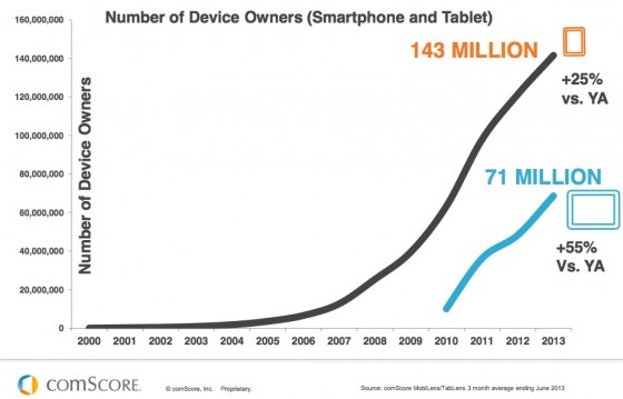
As you can see from this data from comScore, smartphones took off remarkably quickly. But that is still nothing compared to the time period of which tablet adoption skyrocketed. Quite extraordinary, considering many people were baffled when Apple unveiled the original iPad, as it wasn’t a phone, or a PC.

Tablets and smartphones are seeing increased usage for a number of reasons. Some of these include prices, usability, familiarity, and so on. They’re cheaper and more accessible than ever.
The benefits of these devices is growing, and more people are coming around to them, instead of hopping onto their computer. However, a huge trend is “second-screen use”, whereby people will be watching television, or whatever else, but still browsing on their tablet or smartphone. Whilst this may be the impact of media over-saturation or other societal problems, it’s a habit that’s hard to ignore, (And I have to admit, I am one of these second-screen users, for better or worse).
The fact is, people are now hyper-connected at all times, and they like to stay that way. Long gone are the days of television as a sole medium of entertainment on those cold winter evenings; a tablet on the lap is a warm, helpful, productive companion at the same time.
You really do have to ask yourself, when looking at just how many people own and use their mobile devices, why is a mobile marketing strategy still just considered an option? It’s no longer just an add-on to your digital marketing strategy. Mobile internet usage is set to overtake desktop usage this year in 2014, so it’s time to consider mobile in the same league as the traditional PC.
More people own mobile devices, and more people use them. The demographic is widening, and people tend to not only have smartphones, but also their own tablet. Tablets offer a much easier interface for shopping, and a more tactile way of shopping. Tablet ecommerce sales are growing fast, showing 79% compared to the smartphones 43% for 2014.
Mobile accounts for 25% of all ecommerce retail within the UK, which seems set to explode to 40% by 2018. Can you ignore those statistics? For more tips on mcommerce best practice, read more on the post below:
Mobile Ecommerce Website Best Practice: The Do’s And Don’ts
Mobile Devices and Desktop PCs are merging
Mobile devices, whether the smartphone, tablet, phablet, or anything else, have truly come into their own over the past few years. They are faster, better at browsing the internet, and it’s easier to purchase on these devices than ever. 77% of all usage of “mobile” devices is done from home or work where regular computers are available.
Consider the fact that 66% of all emails are now opened on mobile devices, and you can see the impact mobile devices are having on our home and work life.
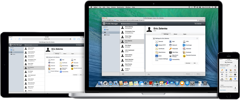
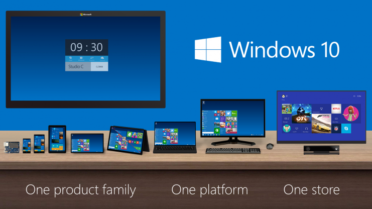
In the same way, PCs are becoming more like our mobile devices. Touch screens are becoming more frequent on both laptops and desktop monitors, and many PCs now have instant-on abilities. App stores are also becoming increasingly integral to the PC experience, with Windows, Apple, and Google supporting apps on their systems.
Cloud storage means we have seamless, synchronised access to files wherever we may be. We can access documents, images, or whatever file we need on our PC, phone, or tablet wherever we are. And mobile devices are getting increasingly good at handling things like word processing that traditionally were home to the PC. Working on a tablet used to be a frustrating experience, but with improved user interfaces, bigger and crisper screens, alongside accessories such as clip-on keyboards, it’s never been easier.
People are making purchases on mobile devices more frequently. It’s no longer just for browsing, and to later close the deal on their laptop. Mobile payments are also more predominant, and make it considerably easier for people to buy on the move.
If you’re curious about mobile payments and digital wallets, such as PayPal, Apple Pay, and Google Wallet, read more on our blog here:
Ecommerce Evolved: Mobile Payments and Digital Wallets led by Apple Pay and Google Wallet
Mobile-friendly? Mobile first
Mobile friendly websites are now a necessity, rather than an add-on to a desktop website. In fact, “mobile-first” web design is chosen by many, to ensure browsing a site on a mobile device is a pleasant experience.
Mobile-first design allows you to really boil down your site’s capabilities, and decide what an end user really requires. This keeps your website design looking fresh, minimalistic, and uncluttered. Then, when it comes to a desktop experience, you can add in additional features which users on a desktop or laptop may make use of.
Google has spoken. Responsive websites are their preferred choice, and when Google speaks, everyone needs to listen. If you fail to rank on Google, then you could lose a lot of potential business, due to a lack of discovery.
Click the video below for a demonstration on how a Responsive design works across different sized screens and devices:
For more information, read our blog here:
Why Responsive Web Design Is The Best Option For Business Going Mobile
The lesson to learn, is that mobile devices are not something we only use when on the move. They are used in the home, and have slowly edged our personal computers, becoming one and the same device.
So if you haven’t got a mobile website, or a mobile marketing strategy, you’re most likely missing out on business. Whether this is by a poorly optimised website for mobiles infuriating users, or that your business is simply not being found on mobile devices, where many consumers do their searches and purchases.
If you need help with a mobile digital marketing strategy, or in need of a fresh mobile-friendly website, then get in touch with the team at Xanthos for a chat.


