There are a huge array of travel companies out there, all striving to gain the attention of more customers on the internet. Therefore, it’s never been more important to have an up-to-date and intuitive travel website to increase your revenue.
Whilst a lot of travel companies make use of similar Web Design features in 2014, there are many which stand out from the crowd; whether that’s because of a unique look, easy navigation, or otherwise helpful functions. Below is a list of some of the top travel site features and web design templates, and it’s a great chance to pick up some tips and concepts for the future.
With mobile bookings on the rise, and expected to be worth $490 billion by 2015, it’s surprising that more travel websites are not fully functional on mobile devices. Although some of the websites listed are mobile compatible, and others offer their own apps, responsive web design is something that is severely lacking in the travel industry.
Virgin Holidays – virginholidays.co.uk

Starting with one of the big players, Virgin Holidays manages to create an attractive website that features most of the important aspects of any travel website. With clear call-to-actions running along the top, an attractive holiday-related background, and vibrant offers gaining your attention, it ticks all the boxes. Sure, it’s nothing hugely different or innovative, but it’s a great start on the basis of how to design a travel website. It may not be to everyone’s tastes, appearing very busy and cluttered, but it certainly provides every function you could need in one place.
Airbnb – airbnb.co.uk
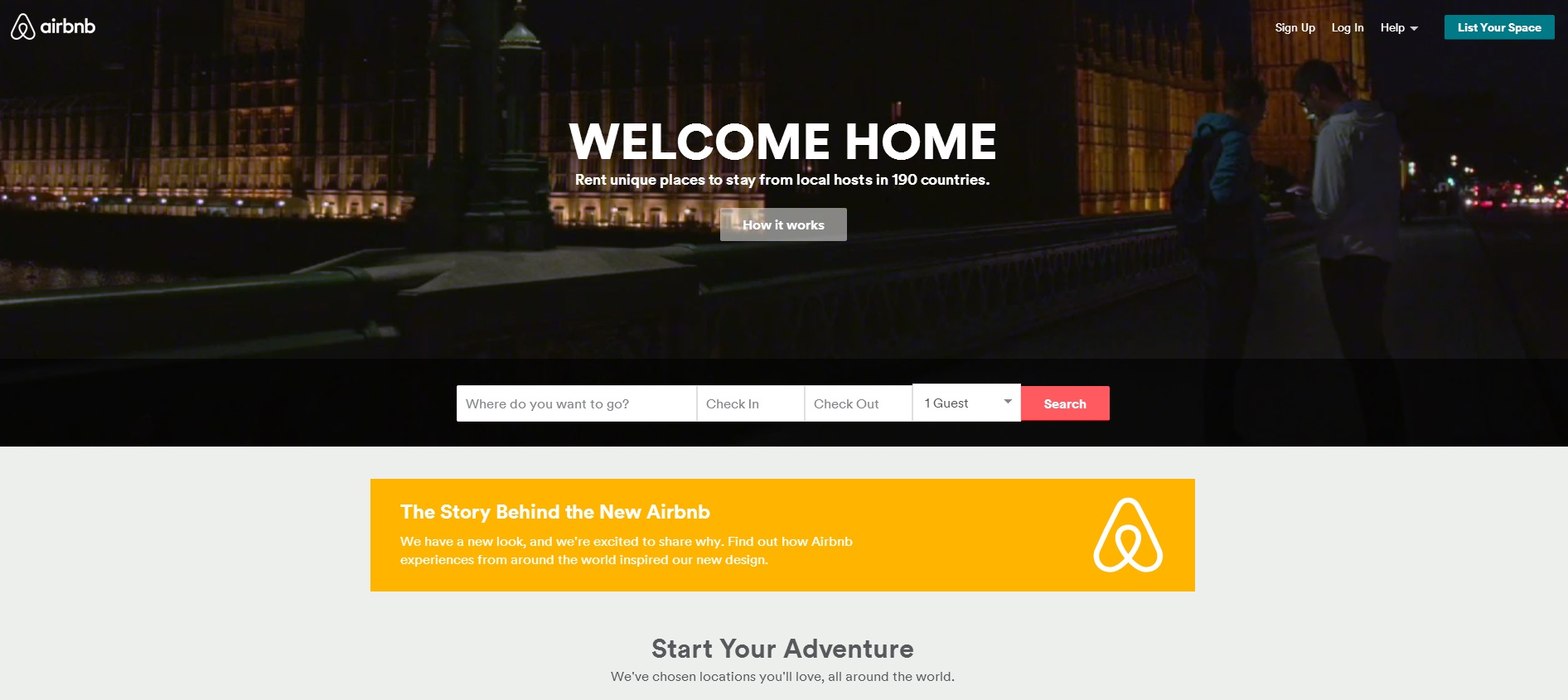
Airbnb has just undergone a huge transformation, in both web design and branding, which appears to have paid off dividends. It has all the main features easily accessible on the homepage, with a unique and inspiring video in the background as a subtle reminder of what it is you love about travelling. It pairs very nicely with the company’s vision of the joys of hospitality, and the fun to be hand staying with other people.
By all means, it’s not perfect. For instance, my biggest annoyance is the “1 Guest” option, which seems like poor phrasing. This website may not be responsive for mobile devices, with an m-dot site replacing it, but this is mostly because they remind you to install their Airbnb app, which is a great alternative for phones and tablets. And this means they can focus on providing a stellar desktop-focused website.
If you need any more reasons to go mobile, then read our blog post here:
Why Responsive Web Design Is The Best Option For Business Going Mobile
Adioso – adioso.com
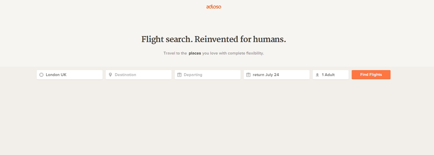
On the contrary, Adioso does not aim to provide an image-driven homepage, instead opting for minimalism, functionality and simplicity. Finding flights has probably never been this easy, prompting you to input necessary information from the beginning. And once you’re through to the results, Adioso does greet you with some spectacular images from some of the best locations to fly to around the globe.
Skypicker – skypicker.com

Skypicker is a very interesting pick of the bunch, with a simple interface displaying your flights on a map in a few clicks. Although it appears fairly cluttered, it’s actually immensely uncomplicated, in that a left-click on the map functions as your “Flight-To”, and right click as “Flight-From”, with the relevant prices appearing on the right. What other websites can boast results in two clicks without typing in information?
Rome2Rio – rome2rio.com
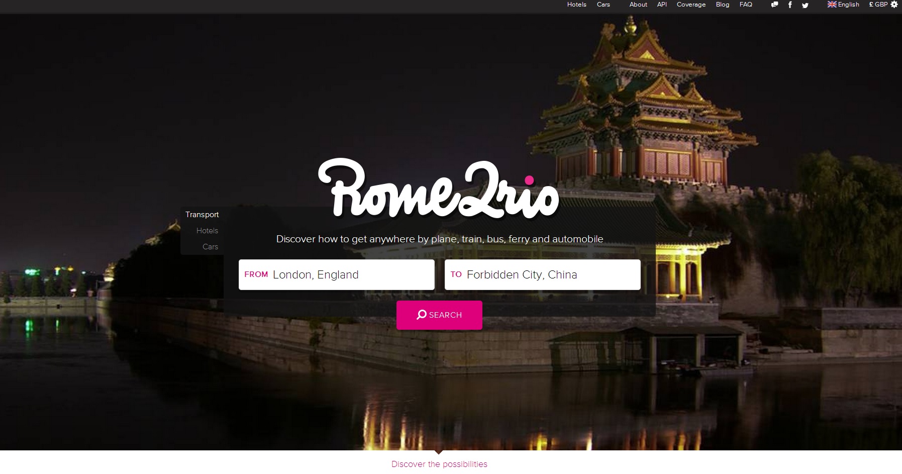
Rome2Rio tells you how to get anywhere by various methods, with only inputting the two places you need to get to. And then it’s up to you to decide how to get there, as it’s clearly demonstrated on a map, with prices and hotel destinations on the left. A great travel advisor, with a parallax scrolling homepage describing how it all works.
Hipmunk – hipmunk.com

A personal favourite (not just for the chipmunk branding), Hipmunk has a clean website, and app for mobile devices. Replacing clutter and images with a sparse yet modern look, the website is very easy to use, and takes little effort to work out what’s going on. Incorporating high-calibre recommendations onto the home page is a huge plus for any new customers who may be a little wary. Whilst the search loads, you’re also greeted with an animated flying chipmunk; what more could you want? A website that does not take itself too seriously.
Momondo – momondo.com

Momondo is very good at what it does, which is using a vast array of analytical data to provide you with cheapest fares for your chosen date, alongside the average price on surrounding dates. The “Best” tab works out the cheapest and quickest flight for you, and combined with the “Flight Insight” option, with a run-down of cheap airlines, best times of the year,and the time you should book ahead. It has a vast array of suggestions, and discovery is at the heart of what makes Momondo different. It also looks very nice indeed, which is always a plus.
Mygola – mygola.com
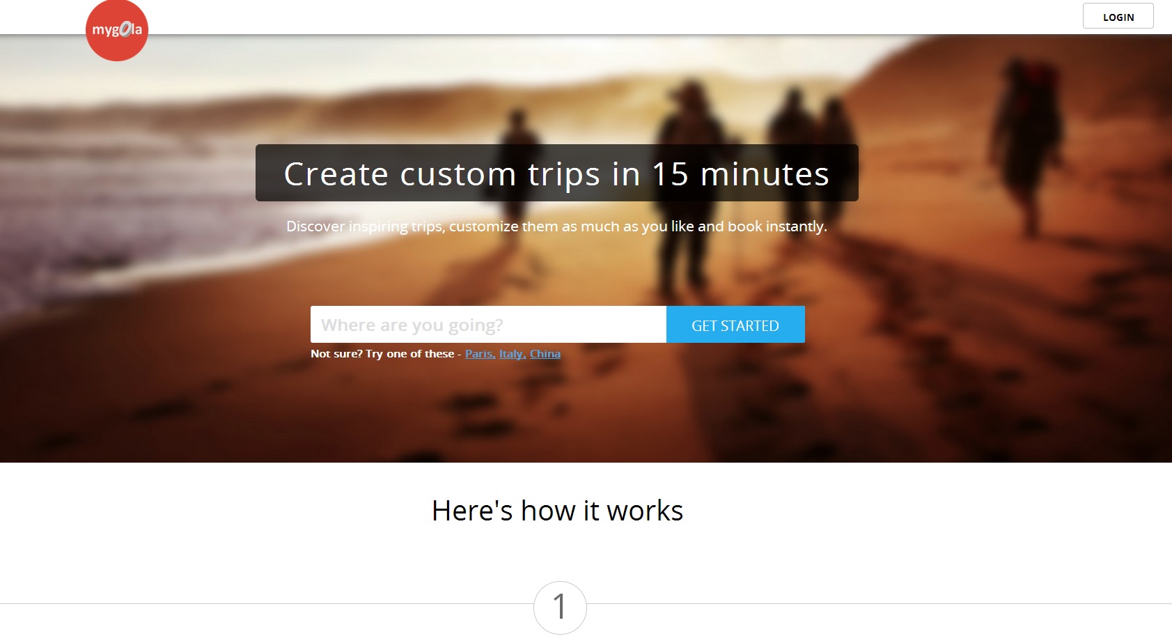
Mygola manages to take the itineraries of others, and make it your own in a relatively straight-forward process. It has a clear aim from the beginning, and by only typing in a place-name, it gives you a huge list of ideas of different lengths and themes, whatever it is you desire. Very clear, concise, and the step-by-step plan could not be easier.
Flightfox – flightfox.com

Perhaps not for everyone, but Flightfox has a sleek, welcoming website, and bases it’s branding on old-school personal experience people may have gotten used to. FlightFox allows you to pay a little something in order to speak to an expert, and sort out the exact trip your heart desires. The homepage explains what it’s all about in great detail, without bombarding you with information. The friendly branding and minimalist design goes hand-in-hand with its back-to-basics approach, as it doesn’t really require a fancy website.
Disability Holidays Guide – disabilityholidaysguide.com
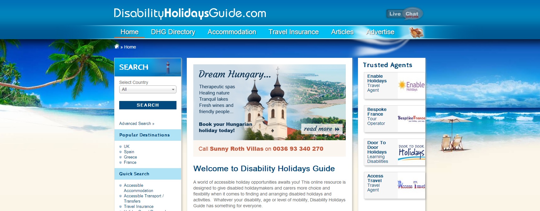
Here’s one of our own that Xanthos built, which we are very proud of. Similarly, Disability Holidays Guide were thrilled with the results it provided. Using Kentico Content Management System they are able to update the site incredibly easily, and it features a crisp look that caters for their audience of people with disabilities, something which proved troublesome beforehand.
If you’re looking to revamp or create a new travel website, we would love to help you on your way. So feel free to get in touch.
If you have any other travel websites that you think deserve a mention on this list, be sure to mention them in the comments below!


