By the end of 2014, there will be a forecasted 27.56 Million Mobile Ecommerce Shoppers in the UK, spending around 8 Billion GBP, and will account for 18% of all Ecommerce. Is your business ready for the future of Mobile Ecommerce?
Over the past few years, Ecommerce has truly revolutionised how we shop, with Mobile Devices subsequently altering our browsing and shopping habits. We now shop on the go, we use tablets as a second screen, and interact with online stores in a completely different manner.
Because of this, it’s never been more important to have an intuitive and stunning mobile Ecommerce website to boost sales, usability, and customer satisfaction. Ecommerce is no longer about just providing a storefront, but it’s also about making your website an asset to your business. This increases the reach and sales potential for your business, giving you the competitive edge against those who are yet to embrace the world of Online Mobile shopping.

We’ve come across many examples of Mobile Ecommerce websites; some are user friendly, and some are simply unusable. That’s why we’ve come up with a list of some of the best examples, mixed in with those needing improvements, to showcase what it is that makes a great Mcommerce shopping experience.
Amazon – amazon.co.uk
It’s difficult to have an Mcommerce website list without mentioning the Ecommerce behemoth that is Amazon. Despite offering a standalone app, Amazon’s mobile website is easy to use, and keeps the same feel and look from their respective desktop website. Usability wise, the repeat purchases many of us are likely to make are incredibly simple to achieve.
Amazon’s mobile site may not be the best looking or most stylish store, but the sheer scale and usability is what makes this a great mobile Ecommerce website. Everyone knows it, and everyone is used to it; and transitioning such a complex website to a mobile device is no simple feat. But Amazon have achieved this. No doubt improvements will come in the future, as Amazon are certainly the leader of the pack, and with Amazon Prime and other products gaining momentum they are only sure to grow.

Firebox – firebox.com
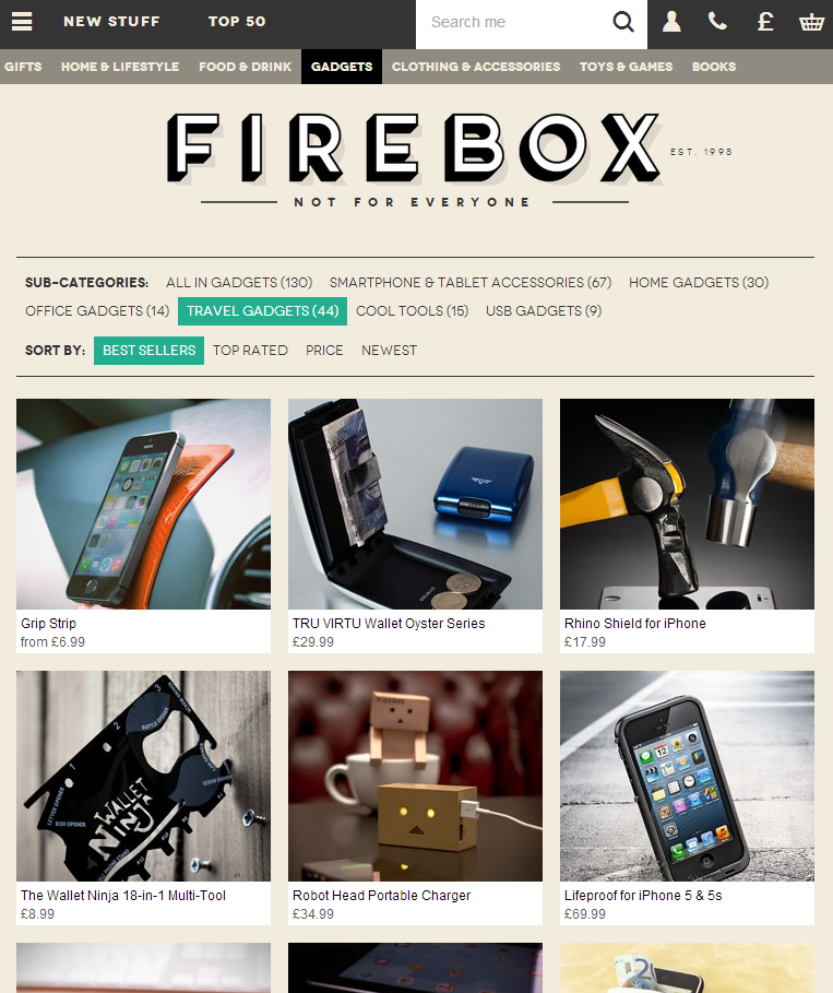
Firebox showcases a different approach to Ecommerce. As a much smaller Online Retailer, you’d expect their website to pale in comparison. Yet their Ecommerce website looks stunning, and due to the fact Firefox utilises a fully Responsive Web Design, it looks great across any device you view it on, keeping the same consistent feel and design.
Why Responsive Web Design Is The Best Option For Business Going Mobile
A key example of Mcommerce best practice is the option for guest checkout on mobile devices, which many people will appreciate, as being forced into registration on a mobile device can be frustrating. Alongside this, they have an easily accessible menu, and key features with recognisable icons displayed at the top right. Their product listings are unique and truly showcase what separates Firebox from other retailers, with their Web Design and colour scheme also reflecting this.
RyanAir – ryanair.com
Now we turn to the dark side of Mcommerce, in the form or RyanAir. Despite offering an app, if you choose not to download it, you are redirected to the full website; which is far from optimised on a 4 inch touch screen device, or any other portable device.
Top Travel Industry Website Designs And Features Of 2014
Manoeuvring and viewing the website is quite frankly a pain, and is sure to be leaving customers annoyed. Despite the fact plane tickets may not be the most spontaneous purchase to make on a mobile phone, RyanAir are just not prepared for the future, or for those who would like to browse on their tablet.

John Lewis – m.johnlewis.com
John Lewis are a huge player in the department store sphere, and their website reflects this. Making good use of a separate mobile website, which is perhaps not the optimal choice, but they still provide great functionality with and concise information at every stage of placing an order. Delivery options are displayed before going through to the checkout, which is very good practice in order to reduce shopping cart abandonment.
6 Ways To Stop Ecommerce Shopping Cart Abandonment
They also merge the online with the offline, allowing customers to search for their local store; not forgetting that a lot of people still enjoy the comforts of retail in the flesh. Their reviews are also clear for users to see, allowing great depth of social proof. Despite the functionality, the appearance and style are lacking somewhat, which may mean people looking to simply browse items will do their shopping elsewhere.

ebuyer – m.ebuyer.com
When going after a tech-savvy audience, it’s essential to have a mobile website that’s optimised for mobile devices. Again, opting for a separate mobile site as opposed to a Responsive one, ebuyer provides a clean and image-focussed mobile website that clearly states the latest offers and deals for customers to take advantage of.
Alongside this, ebuyer has an incredibly easy-to-use menu allowing customers to login and view their basket without any fuss whatsoever. Each product page has clear Social Media sharing buttons, which adheres to the best practice for Mcommerce, as people often share content from their mobiles via Social Media and messaging apps like Whatsapp or Skype. Another piece of good practice is the swipeable showcased images, which is great for touch screen browsers.

Zara Home – zarahome.com
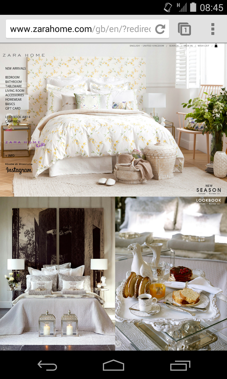
Quite simply, the navigation on this site is impossible on a Mobile Device. Whilst the aim here is clearly to opt for imagery and showcase the beautiful products Zara has to offer, which they ultimately achieve, it’s incredibly frustrating to find your way around the site to find any of the featured items.
To begin with, you are greeted with a menu to choose your location, to be followed with a bedspread with miniscule text on the left hand side. This menu lacks any background elements to allow it to stand out, which is quite simply bad Web Design practice. Frankly, this site has many improvements to be made in the near future.
Currys – currys.co.uk
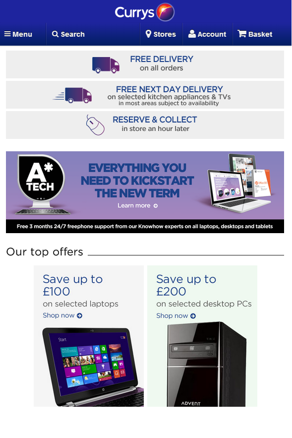
In the technology sector, people often know what they want. Currys knows this, and so opts to clearly display special offers and promotions, in a very nice colour scheme that instantly leaps off the page (or the screen). This fully Responsive Website looks great wherever it is viewed, which means customers know their way around the website from wherever they are accessing it.
With the GPS Nearest Store Geolocation feature, it allows integration between the online and offline worlds of shopping; also including visible store opening times, which many people may be searching for. Currys ensures they are optimised for mobile shopping, but can maintain their offline interaction in the retail world.
Play.com – play.com
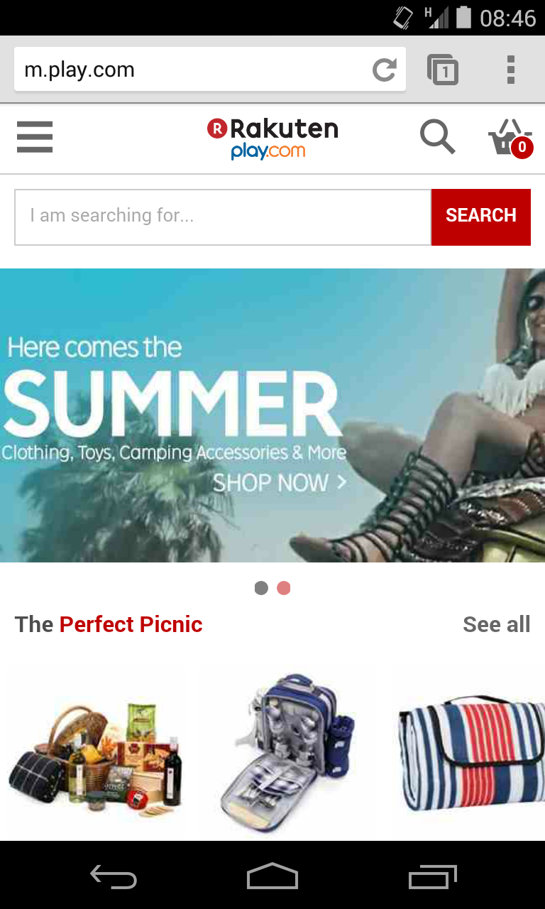
Whilst Play.com is a huge player in ecommerce, the mobile website is kind of lacking. It all works well, and you can search, but for browsing purposes? Not so good. With limited items showcased on the home page, it’s not that great for online window shopping. If you know what you want however, then it’s perfectly functional, but it certainly won’t blow you away.
Of course, the saving grace is that Play.com do offer an app, so if you are a returning customer, making the most of this is a must. But it shouldn’t have to be a requirement, which is why mobile ecommerce websites need to be continuously improved to capture customers who may not have done business with you before.
ASOS – asos.com
When it comes to online clothes shopping, ASOS are the current forerunner. Without the need for brick-and-mortar stores, they have shaped their business purely through their website. So it’s no surprise that it is well formed, and works great across different platforms. Despite the looks, the functionality is also top-rate.
With Product Recommendations being displayed whilst browsing, ASOS manages to keep your interest, maintaining a fun and informative shopping experience. The checkout process is also very focussed with very little distraction, inevitably leading to an increased number of conversions. It also has clear Social Media integration, for people to share via any network they wish.

Waitrose – waitrose.com
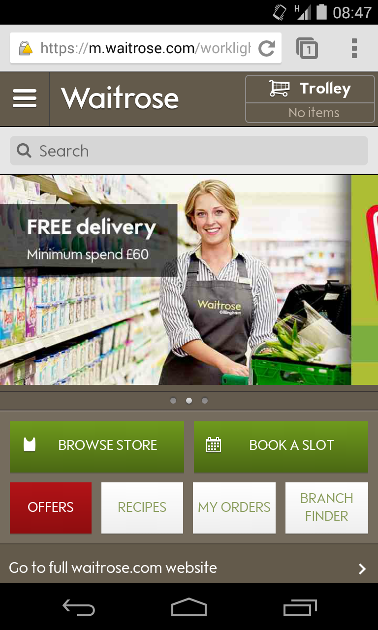
Waitrose have gone for a mobile website with a colour scheme which reflects their brand very effectively. The shopping experience is simplistic and has few frills, providing an efficient mobile shopping experience.
Straight from the home page, you can book a delivery slot, or browse for local stores, which is essential information many customers would be looking for. Also, it features a nice image slider, which is great practice for touch screen optimisation. It also looks quite pleasant, which is always a bonus.
These websites all look very different, and work in contrasting ways, showcasing the effectiveness and importance of certain features. It goes to show there are many different approaches to mobile shopping, with a lot depending on your business, yet best practice is still incredibly important in order to allow for a great user experience, however they are accessing your site.
If you’re looking to build a new Ecommerce Website, or perhaps expand your business into new territory and need advice, do get in touch with us at Xanthos; we would love to hear from you.


