Sometimes it’s difficult to discuss best practice web design without having a solid example to refer back to and to analyse.
For this reason, I’ve picked a nice looking ecommerce website called the Famous 4th Street Cookie. There are elements of it that I would change, but overall, I think it’s a pretty good example of good design in practice.
For readability purposes, I’ve broken this discussion into the following categories:
- Navigation
- Homepage call-to-actions
- Site layout and design
- Website copy
- Technical details
- Checkout process
Navigation
You really wouldn’t believe how much goes into the design of a website.
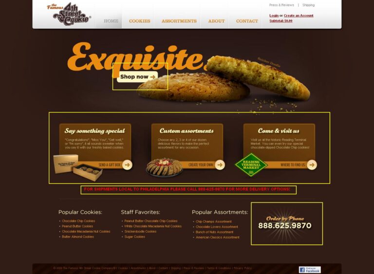
There’s only one way to describe 4th Street Cookie’s navigation and that is ‘Yummy’. Number one, it’s got one of the most amazing drop down navigations I have ever seen. Take a look:
It’s also got a grey hover state that highlights where within the site you are at any given time. Check the picture below – I’ve clicked the contact page and the navigation has greyed out over the contact button. All modern websites should show where within the site the user is at any given time.
The company logo also links back to the homepage when you click on it. For many website users, it’s now second nature to do this. Not doing so risks irritating some of your audience. However, I wouldn’t recommend replacing your ‘Home’ link with the logo. Not everyone knows that the logo often acts as the link.
Other important information is also included near the top of the page: links to ‘Press & Reviews’ and ‘Shipping’. The first is probably a link that the company wants you to notice and take a look at. The second – a link to their Shipping page – is one of the pages customers probably most regularly ask questions about. As such it is placed where it will be noticed and very cleverly – just above the shopping cart, which is exactly the time people will begin thinking about shipping.
The ‘deep footer’ is another excellent addition to this website. Typical of blogs, footers like this are becoming more and more popular. It’s a good way to give people the option of browsing differently – by what is popular or by staff favourites.
At the very bottom they’ve also included all the necessary legal information and links to a few other pages users might typically expect to find in the footer area – terms and conditions, privacy policy, etc.
You’ll also notice they’ve got a social media icon nested in the right corner of the page – whether or not this is good placement is entirely dependent on the company’s strategy. Typically I would put social icons at the top of the page where they can be seen whether or not someone scrolls down to the footer. But, if Facebook is not as important to 4th Street Cookie, there’s nothing off about where it’s situated, especially considering that its current placement does not break up or affect the site’s minimalistic design.
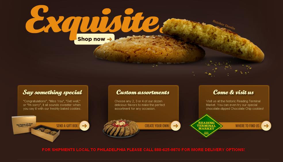
In addition to the usual text navigation, 4th Street Cookie has additional picture navigation. See those 3 boxes below the slideshow? Each of them is a call-to-action and a link to an internal page. This means that with very little thought, the user is able to see where they can leave a review, that they can actually create a custom assortment of cookies and where the company is located. Plus, those little arrows on each of the boxes are a part of the site’s good design. Without them, people might not know the boxes are links. The same thing is true of the hover estate over each of the boxes.
So, if we’re going to give them a score on ‘navigation’ I’d say we’d give it a 5. It’s lovely!
Homepage call-to-actions
As far as I can see, there are four call-to-actions on the homepage. As we’ve just discussed above, those main boxes below the slideshow definitely count, as does the ‘shop now’ button in the slideshow and the bold telephone number in the deep footer. Another one, perhaps less obvious, is the line of red text just below the slideshow. It’s more obvious on some of the internal pages, but it works because there is no red in the design, thus it really does stand out.
In Wikipedia’s words, ‘a call to action or CTA is a banner, button, or some type of graphic or text on a website meant to prompt a user to click it and continue down a conversion tunnel’.
This is exactly what each of the aforementioned CTAs do. Now, take a look at the ‘About’ page. Even it has a call to action of its own: ‘Our Quality Guarantee’ – noticeable because of the bold, orange text that draws your eye right in after the page’s heading.
And finally, the CTA on the contact page is as it should be – a big, bold number which thank heavens for new ‘web design standards’ is not actually flashing.
Again, that gets 4th Street Cookie yet another 5 out of 5.
Site layout and design
Let’s begin at the beginning – what does the website evoke? A feeling of nostalgia perhaps? Chocolateyness? Cookies (duh)…and, if you’re astute enough…Sesame Street?! I didn’t pick up on this at first. It was only after I asked one of the company designers to look at it, that I fully appreciated the site’s design.
Sesame Street you say? Where do you see that? A few places actually.
Regardless of whether or not the logo was created in conjunction with the website, it’s still brilliantly done.
Number one: the logo is written in that old style font popular on many record covers and posters, and a font that is also similar to the original Sesame Street branding. Number two, check out the ‘come and visit us box’ below the slideshow. Right on top of it is a little green and yellow sign which is exactly like…you’ve got it – the logo from Sesame Street. Plus, don’t cookies always remind you of the Cookie Monster?
I’m betting that part of the reason this company has chosen to incorporate the Sesame Street style branding into their design, is that they’re trying to evoke nostalgia. If they can make you long for days gone by, they can probably transfer that longing into getting you to make a purchase. After all, if you can long for the past, you can long for a cookie, and more specifically, a 4th Street Cookie.
Beyond the initial impact of the website, the fact that is it consistently laid out is also important. Obviously users expect a little change when navigating from the homepage to internal pages, however, this should not be taken for granted. If you make your internal pages too different, especially from one another, you’re going to risk frustrating the end-user as they’ll have to keep re-learning your site. Some things should stay the same including: logo and shopping cart placement, main navigation, footer information and corporate branding. Change it too much and your user is going to think they’ve been redirected to an entirely different website!
Beyond that, colours are consistent, pictures are good quality and the content is easy to read. From me it gets … you guessed it, yet another 5!
Website Copy
Now, this may not seem so important to you, but actually it is. Very much so. Great web copy goes a long way when it comes to getting your customers to read what you’ve written; to engage with you and to share your content with friends.
It’s no joke when you hear internet marketing gurus say ‘content is king’. Plus, search engines like Google pay attention to how long visitors stay on your site and for that matter, how much time they spend on each page. Including enticing copy is going to get them to stay on the page a bit longer.
Plus, if you’re boring – well, it’s going to reflect badly on your company and your products and, it’s going to mean people probably don’t read anything you upload.
I’m not saying you have to go mad with adjectives, I’m just saying your copy has to stand out from the crowd. Yes, it’s got to apply to your industry, but no, it doesn’t have to involve droll ‘we we we’. When you’re writing website content, keep your target audience in mind, but also, have an idea of what the content is supposed to accomplish.
When it comes to ‘4th Street Cookie’s’ web copy, it’s good. It’s succinct and descriptive but not over the top. Paragraphs are short and so are product descriptions. It’s all as it should be.
The slightly more technical bits
When it comes to how fast a web page loads, you don’t want to be playing around. If your page does not load quickly, you risk losing visitors. For most people, 4th Street Cookie won’t take too long to load, assuming you’ve got a good broadband connection, and in spite of the fact that the company in question gets a very average page score. To run a simple page speed test, I’ve used a free ‘page speed’ calculator by GTmetrix (www.gtmetrix.com). 4th Street Cookie gets a Page Speed Grade of 66% and a page load time of 1.69 seconds.
GT Metrix will even tell you which aspects of your site need to be improved in order to increase page speed. In this case, it would involve doing the following:
And for this reason, I’m afraid page speed is going to get a 3 out of 5.
Checkout Process
Don’t force the account creation (registration process)
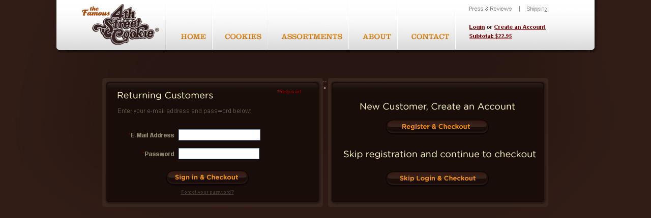
4th Street Cookie has been marvellous at not doing this. They’ve got a few really easy options that let you check out exactly as you want to. You can either checkout using ‘returning customer details,’ or you can create an account as a ‘new customer’, or you can skip the whole registration process and simply checkout.
Ensure the checkout area is isolated or self-contained
It’s not entirely isolated but there’s not much distracting information to guide you back to the cookies. As Crazy Egg have said, “The ideal situation here is for the customer to get to the order confirmation page as quickly and easily as possible…don’t make it easy to exit the checkout – do make it easy to find relevant information and help.”
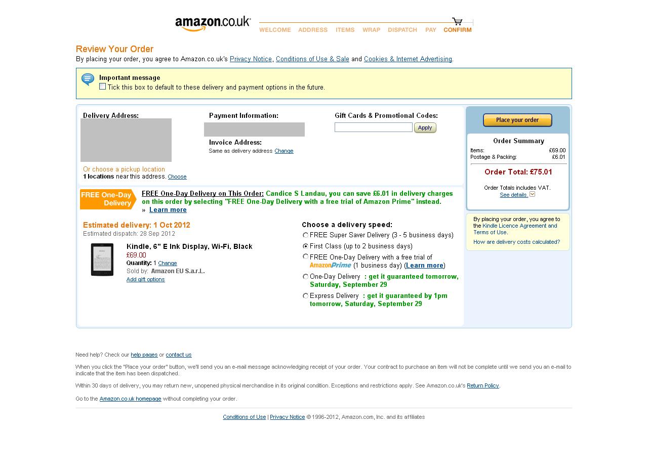
Amazon.co.uk provides a perfect example of isolating you into the checkout process:
Have a short, stepped checkout process and show the customers where they are within the process
Now for some reason unbeknownst to me, 4th Street Cookie does not like my telephone number and so, I sadly cannot go ahead and complete the registration process.
Typically if you’re in the checkout area, you should show a customer where they are in the purchase process as well as how far they’ve got to go. My favourite website for this is Amazon, but loads of other companies now do something similar too.
In this diagram I can see exactly where I am and how far I’ve got to go as well as what each stage will likely entail. Easy.
Make form filling easy and intuitive through good design and best practice
According to Crazy Egg this entails making use of asterisks for mandatory fields; using drop downs when you’ve got a long list of options; and using radio buttons when there are only a few options.
In general, form filling should be intuitive. On 4th Street Cookie, that little ‘same as billing’ button is a lifesaver and it means you don’t have to enter separate billing and shipping addresses if they are one and the same. Plus they’ve marked out the mandatory fields. The only thing that irritates me is that they’re not telling me what is wrong with my phone number – have I formatted it incorrectly? Should I not include the area code? What is a valid phone number according to 4th Street Cookie?
And the last two points, which I have no way of knowing whether or not they’ve applied include:
- Have clear delivery/shipping costs upfront
- Reassure customers their card details are safe
Other than that, I think it gets a 3 out of 5 from me! Points off for the aggravating phone number issue and a point off for not entirely isolating my experience so that I can focus on paying.
Conclusion
Ovearall, 4th Street Cookie has a beautiful website and they score well on pretty much everything. Naturally there are a few areas that could be improved, but I’m sure this is the case with every site. If you can think of a site you think is worth discussing, send the link over my way.
And if you’ve enjoyed this article, don’t forget to share it!


