2014 – The Flat Web Design Trend
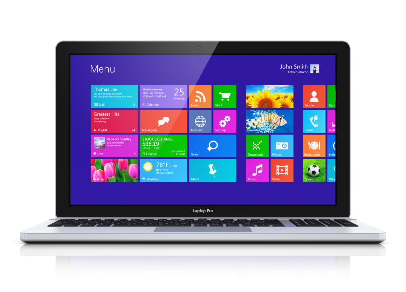
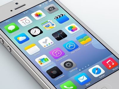
You’ve either heard about flat design or you’ve seen it. It’s the style of design typically associated with user interfaces like Windows 8 and Apple’s iOS 7 and is characterised by 2D elements and flat iconography, bold colours, simple typography, minimalism, and by a general paring down of data.
It has become popular in part, thanks to the growth of mobile devices like tablets and smartphones. According to Jusin Van Slembrouch, design director at Digg, flat design
“is increasingly being driven by mobile, where you’re designing for the lowest common denominator so you can’t load a site up with heavy graphics [sic] the end result, with flat design, is that it all feels less cluttered.”
Microsoft is widely credited as the ‘founder’ of flat design, though according to the company, this ‘style’ goes much deeper and is not just a trend but a result of principles considered to be foundations of design at Microsoft.
While flat design is becoming increasingly popular – it has been adopted by the likes of Apple, Twitter, and Google – as with all design trends, it is just that… a trend, and a trend that will be replaced by another trend. At present, what matters is that you understand the fundamental focus of flat design is to respond to the need for a fast, seamless mobile user experience.
Is flat design for you?
Now, if you are wondering whether you should give your website a ‘press’, first consider why you’re doing it. If it’s simply for aesthetic purposes or to fit in with the latest trend, you’re wasting time and money. If however you are seeking to create a user-friendly mobile browsing experience, flat design is a good idea, especially given that Google is now pushing developers to build mobile-friendly websites – that is websites that are responsively designed and that operate at a high speed.
If you want to create a mobile-friendly website, a website redesign focused about a flat user interface, is a great idea. Not only will the simple elements typical of ‘flat design’ be more likely to speed up your site load time (and help you avoid a future mobile penalty from Google), but they’ll encourage you to focus on what is important as you cut back on unnecessary elements that detract from the goal of your site. And of course…you’ll look on top of things!
Examples of Flat Web Design
Microsoft’s operating system is possibly the best-cited use of a flat design. If you’ve got a computer running Windows 8 you’ll be well-versed. The solid colors, simple boxes, simple typography and basic icons are classic of the Windows 8 style.
This example is much easier to get a grasp of if you actually have an Apple phone running the latest operating system. Otherwise, take a look at the screenshots of the OS.


