Ecommerce web design can be a complex matter in 2015, especially when choosing the features or design choices to opt for in your new website build. And now with the immense amount of competition out there in 2015, you can’t afford to have a shabby or impractical website.
However, to make things a little easier we have compiled a list of ecommerce web design inspiration for 2015, which should hopefully help you decide what features or design choices you would like in your next website design. See our list below, and learn which styles or features could help your brand make a mark online.
Mulberry – mulberry.com
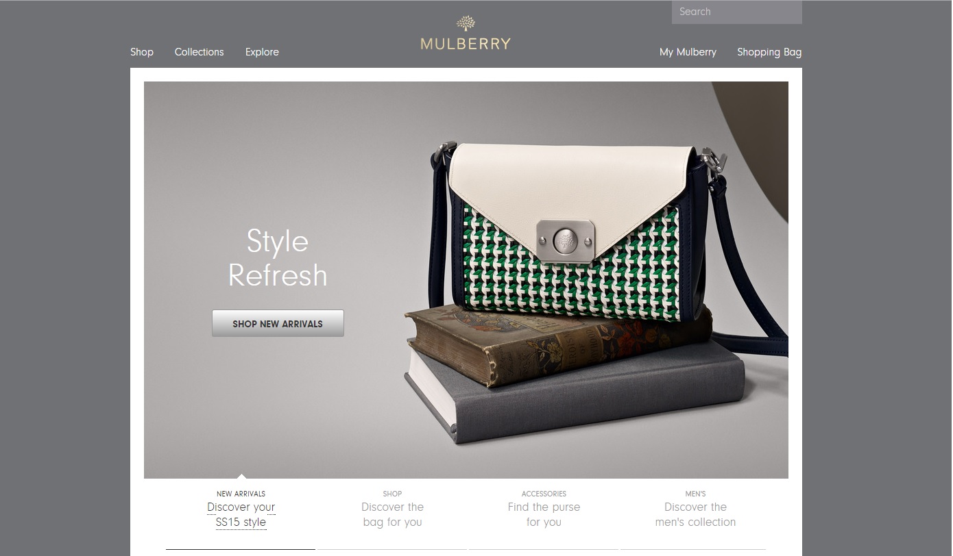
Mulberry are an incredibly well-known brand, and so it makes perfect sense that their website reflects what they have to offer their customers. It reeks of class, style, and showcases exactly what the brand is all about.
The design itself is stylish and minimalistic, with a relatively simple layout that focuses on the products in question. By laying off with additional complex design, the focus on the products makes them the centre piece of the design itself; and with products that look this good, it works very well. The artistic style replicates the “Mulberry experience”, and how their products take centre stage.
The website also features numerous photoshoots or “lookbooks”, showing the products in their best light. Making use of a blog and galleries which feature the products in use, with celebrities and other high profile people being featured, is a great way method in order to differentiate their online shopping experience.
Master & Dynamic – masterdynamic.co.uk
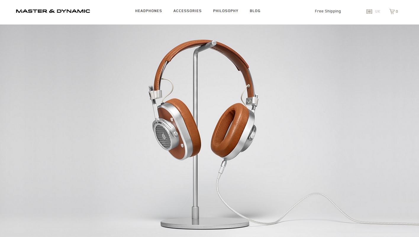
The headphone wars are still raging on, after Beats having single-handedly reinvigorated the market for stylish and powerful headphones. Master & Dynamic have managed to make a name for themselves, and separate themselves from the pack with incredible looking and sounding headphones. Their website makes sure you understand this.
Focusing on the flagship product in question, the MH40 headphones, the home page shows just how great they look. There’s no unnecessary detail or styling, and keeps the menu simple.
Clicking the menu brings up their 4 different headphones, which keeps things nice and simple without overcomplicating the shopping process. Accessories does the same; whether you want a boom mic, a stand, or a gift card. No frills, but why would you need frills when you’re in the market for a high-end pair of headphones? It’s straight to the point in order to boost conversions and ensure you find what you need with as few clicks as possible.
Their philosophy page highlights what makes the brand and the products so special, with a nice scrolling style that uses images to explain why you should choose their brand. They also make great use of video marketing with original content hosted on YouTube, featured on the page. The blog is also easily accessible, with a lot of interesting and useful content which features the brand and other artistic ventures from around the world. Social icons stand out at the bottom of the page, whilst staying in-line with the rest of the web design, and it also features a unique and simplistic email sign-up option.
IKEA – ikea.com/gb
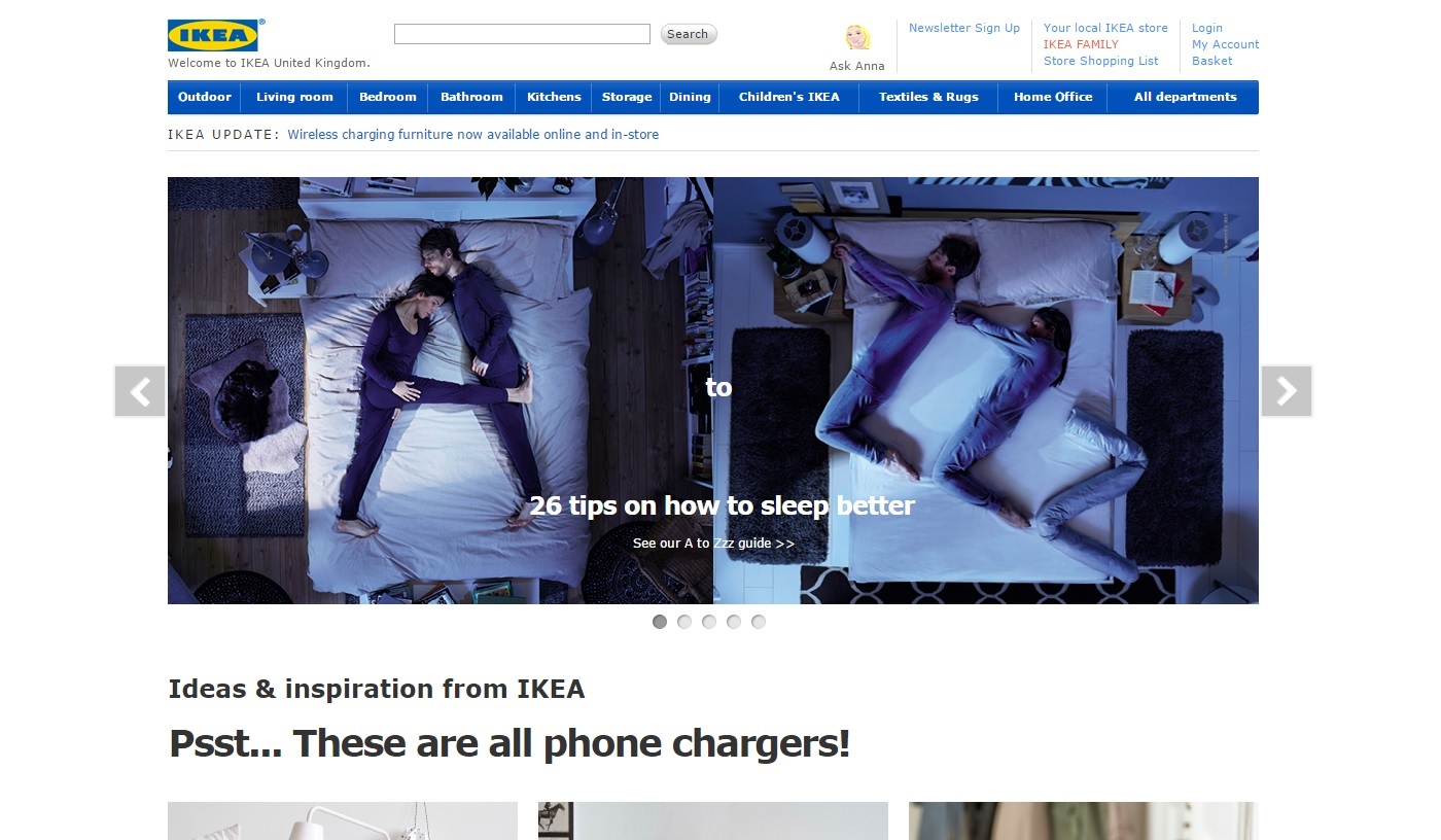
IKEA are a world-renowned brand, and although their website may not be the flashiest site out there, it certainly reflects the size of the company alongside their sense of style.
The website itself is clean and provides a sense of minimalism that is seen throughout their products. As far as product pages, you can filter your preferences via price range, whether it’s buyable online, and sort by a number of different factors. It also highlights other products you may also be interested in, which usually work well together in order for you to piece together your perfect room.
As for features, the main home page has a striking carousel that showcases relevant products and news, which is always great to see. As a bonus, one image shows some of their latest branded content on how to sleep better; which shows how IKEA are adding value to their brand via original blog posts for their content marketing efforts. Highlighting this on the home page is a great way to welcome visitors, whilst showing customers what their products can actually offer.
Not on the High Street – notonthehighstreet.com
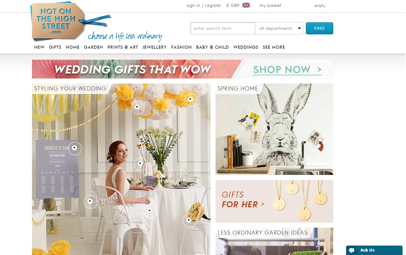
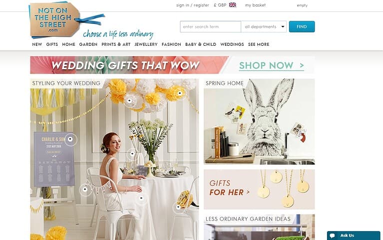
Not On The High Street features many quirky and craft-related gifts on their website, which is reflected throughout the design of their website.
They mainly provide unique and personalised gift ideas, and certainly manage to showcase how personal their products are on the home page; whether it’s a gift for a friend, a birthday gift, or even a gift for a baby. The eclectic mix of products and styles shows that they cater for every personality, and that you will be able to find a gift for that special someone who deserves something more than ordinary. This means mixing up the image designs for different audiences; and yet they still manage to ensure the designs so not clash with one another.
The home page features a nice photo which showcases numerous products you can buy on the site, and links through to the appropriate pages. It also has imagery to link you through to categories you may be looking for, such as “gifts for her”.
Overall, the crafty and handmade feel that many of the products have is shown throughout the website, from the logo to the fonts used. Even their email sign-up makes use of their company vision, stating: “UNIQUE. INSPIRING. Our emails aren’t like other emails.” Enough said, really.
I Want One Of those – iwantoneofthose.com
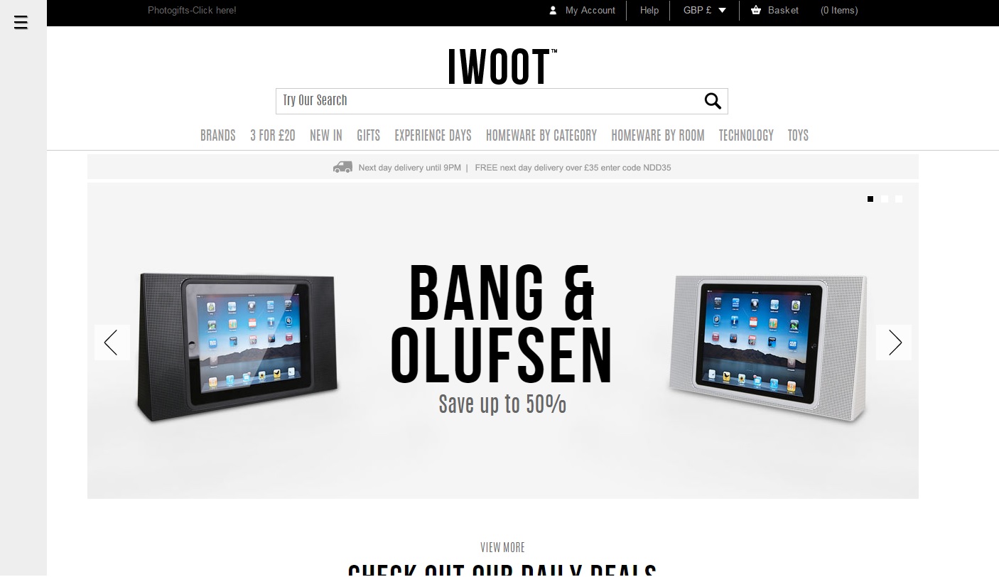
I Want One Of Those (IWOOT) has a simple and clean design, that reflects the focus on technology and gadgetry that the website offers.
With curated lists such as daily deals and must have items, IWOOT manage to make you yearn after items you never even knew existed; making the name of the site very relevant indeed.
These curated lists and product pages show great imagery of the unique and fun items on offer, and allow you to refine your choices further on the left hand column. Also, featuring certain offers at the top of the column allows customers to save themselves money, whilst also tempting users into generating more conversions for the business. Sorting homeware by category and by room is also a nice added touch, for those who are merely browsing and don’t have a specific product in mind.
Overall, the site manages to create a fun and engaging shopping experience, rather than the usual quick in-and-out shopping style when you know what you’re after. This is a site for when you don’t know what to buy your friend (or yourself) for a special occasion.
Coach House – coachhouse.com
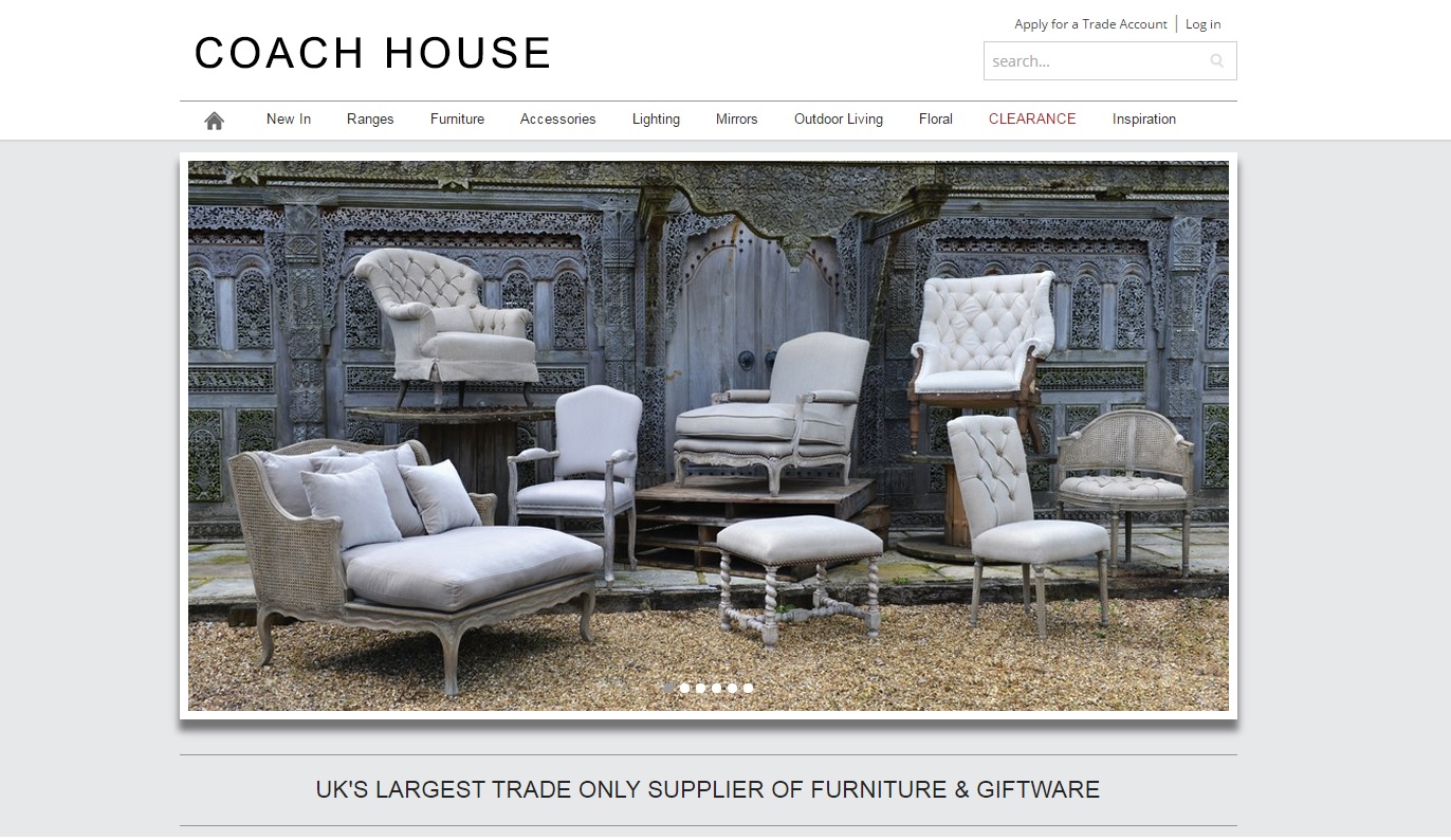
Xanthos built the new Coach House ecommerce website, as Coach House felt their old website was looking dated and needed updated functionality. Coach House are the largest trade-only B2B furniture and giftware supplier in the UK, and needed their new website to reflect their position within the market.
The website has an intricate mega menu that allows for images to be placed and customised within it, alongside a powerful on-site search with predictive search features, with an instant product display to help drive conversions. The site also has specific B2B features, including the fact prices are only displayed when a user is logged in, and a quick check-out option for an express shopping experience.
The website is also fully responsive, meaning it looks great on mobile and tablet devices, alongside the desktop counterpart. This ensures that it is future-proof, and encourages users to convert on whichever device they may be using. It keeps the same functionality, and opts for a slimmed-down design that keeps the core concept of the site the same.
If you’re looking to launch a new ecommerce site, or simply redesign your current site as it’s looking a little dated, get in touch with the team at Xanthos, who have over 12 years’ experience in helping brands grow their business online.


