According to The Internet Retailer, Goldman Sachs is predicting that by 2018, global mobile commerce (m-commerce) will account for nearly half of all ecommerce transactions. That equates to a staggering sum of approximately $626 billion.
If you’re not thinking about your mobile strategy now, chances are you’re going to lose out on a big slice of the pie.
Transitioning to a mobile-friendly version of your online shopping website doesn’t have to be something you agonise over. If you do not yet have the time or money to put into creating an entire website exclusively for mobile usage, no problem. There are a few things you can do to ensure a seamless transition from a website that’s solely suited to desktop purchases to a site that people can use to purchase on the go.
Here are a few interim solutions:
1. Build or adapt your web design so that it is ‘responsive’
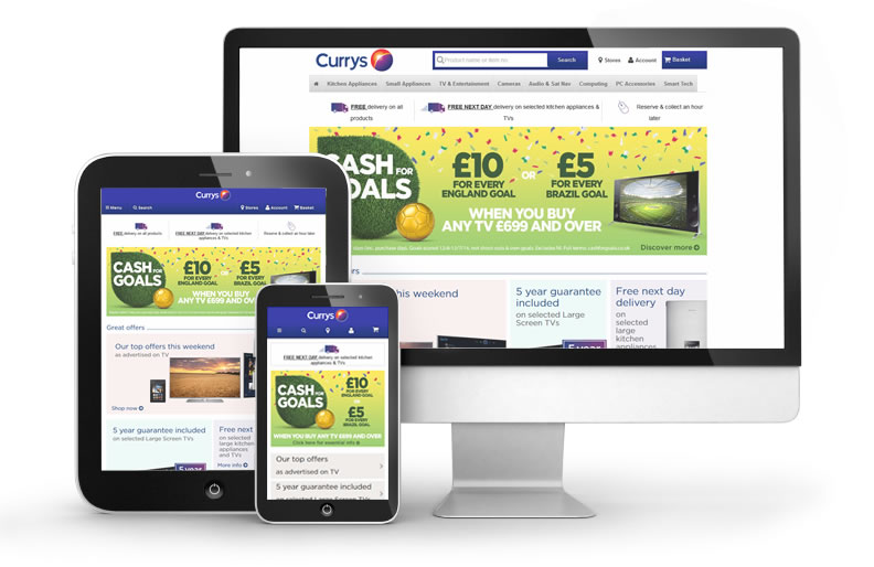
If you’re thinking of redesigning your website now or in the future, go with a responsive web design. This will ensure your site adapts to suit the screen size of the device your audience is using at any given time. That means that if they’re using a smartphone, they’ll see a site that perfectly fits their screen. Perhaps the navigation will be different, or perhaps there won’t be a slideshow. Even if the content is the same, it’s likely the layout won’t be or that it will be stacked. By that same token, if your audience is browsing your site on a tablet, they may see a little more and perhaps in greater detail or at least laid out differently. Take a look at the Currys website for a great example. When you view the website on a desktop you see a whole lot more than if you’ve viewed the smartphone version:
2. Avoid ‘tiny and unclear things’
Consider: if you do not yet have a mobile version of your website but still want to allow users the chance to make purchases from a mobile device, remember that if your text is really hard to read or really small and if links are not obvious – underlined or in a different colour – you’re probably going to infuriate your audience. Instead of risking sour relationships, why not make everyone’s life easier with clarity. Also, if you are actually in the process of designing a mobile website keep the following in mind:
- Apple recommends a minimum target size of 44 x 44 pixels (approximately the size of a human finger)
- Windows suggest 34 x 26 px
- Nokia 28 x 28 px.
3. Avoid animations or slideshows that take a long time to load
If you simply cannot dispense with a slideshow, above all make sure that you’re not using Flash based images as Apple and various other devices do not display flash. Also be sure that your images have been saved in a format that decreases their size. If you’re not sure how to do this, speak to a web developer or your digital agency.
4. Shorten the checkout process and limit text or form fields
If your users are going to have to see the full website on their mobile device, they’re unlikely to stick around if they’ve got to keep zooming in to read content and then zooming in and out to fill in fields. This will also mean that you’re going to need to adjust the time you allow users to move from one part of the site to the next. Shorten it. Cut out pages. Get rid of unnecessary clutter. Browsing websites that are not designed with a mobile audience in mind is tiring.
5. Make sure your site loads quickly
Apart from reducing frustration, there’s a reason I mention site load time. Not only is site speed an SEO ranking factor for non-mobile websites, but according to Barry Schwartz of Search Engine Land, in June 2013, Google said that in the future, mobile-websites that took too long to load would likely be penalized. To avoid getting hit with a penalty that drops your site’s rank on mobile search, do as much as you can to speed up your load time.
Things to do to speed up your website:
- Leverage browser caching
- Use a content delivery network
- Optimise your images and specify dimensions
- Place your CSS stylesheets at the top of your site, in your document head and any javascript at the bottom
- If you use Wordpress, install plugins like WP-Optimize, WP-SmushIt and jQuery Image Lazy Load. You can experiment with how these plugins change your site speed.
- Choose a good web hosting company, especially if you’re sharing a server


